Evolution of Apple.com

Neely was talking to me about the “original” Apple Computer Stores from the 80’s. But I wasn’t able to find any images of them but instead found some old snapshots of the old Apple’s website thanks to Apple Gazette and EMU. All, but the first and the last, captions are direct copy/pastes from Apple Gazette.

apple1995
The original apple.com from circa 1997.

apple1997
From 1996 to 1998 this is what Apple.com looked like. By today’s standards this site is laughable (although still better designed than MySpace), but at the time this was cutting edge.

apple1998
In 1998, Apple updated their look with this much more streamlined design.

apple2000
In 2000, Apple redesigned the site again. This new design is essentially the “missing link” between the 1998 design, and the layout that is still used today. Notice the red apple at the top of the page.

apple2001
In 2001 the front page recieved another slight make-over. This time the “News Headline” bar was given an Aqua enhancement, and the Apple at the top of the page turned blue.

apple2002
In 2002 the Apple in the top corner became gray (which it still is today). The rest of the front page remained virtually the same – only the site features significantly changed.

apple2006
The current front page design of Apple.com is almost identical to it’s 2002 counterpart, except for the “News Headline” bar, which is now a simple grey, and the addition of the iPod+iTunes tab.

apple2007
This was snapped just now in 2007. The look and feel has been significantly updated to match the look and feel of Leopard. Also various interface face elements were also cleaned up throughout the site. I suspect this new revision will be around for another couple of years or so until the next cat is out of the cage from Cupertino.

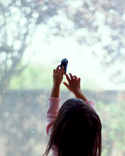
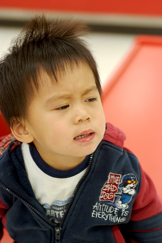
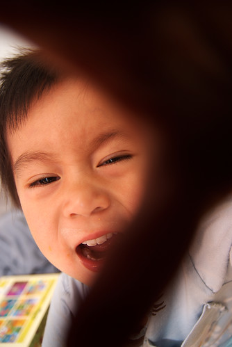
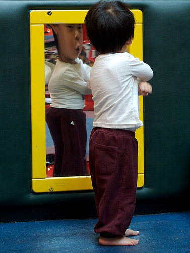
More Shots from My Last Shoot

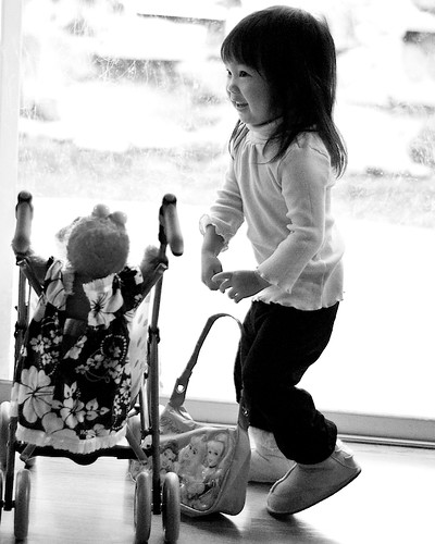
I have been experimenting with different workflows. Since I am just starting out and charging such low prices with very liberal terms for my images, I figured this is a perfect time to try different things out and see what works best. Unfortunately this was a “failed” attempt in trying to adopt using Fujifilm’s awfully designed Hyper Utility software that they even had to galls to sell separately from the camera.

So next up Adobe Camera RAW! Now I’ll have bout 600 shots from this past Saturday to experiment a new workflow with. What fun! (< -- Insert Sarcasm) Strolling Fun

Rest

Kristina

Sweet Girl

I Wish

Crusing on the Window

Taking MAMP More Seriously

This is the last draw. I am going to start using MAMP’s local web server solution seriously this time around.

It all started when I decided to upgrade to Leopard. I backed up everything else except for the MySQL database files that don’t exist in the

1
~/user_name/

directory. So in upgrading to Leopard, I also blew away all of those development databases I was using for clients — great, now I’ll have to go through the motion of having to repopulate those databases manually…

The only gripe I have with MAMP is that it literally forces all the development files to uncharacteristically reside in the

1
/Applications/

folder. I suppose I could move them somewhere else. But I just don’t have the time to deal with customizing it otherwise.

So from now on, literally everything that matters will be within the two places that I back up

1
/Applications/
1
~/user_name/

I also forgot to save my Addessbook contacts. But thank heavens the address content reside in

1
~/user_name/Library/Application Support/AddressBook/

so I was able to recover them. But even if that failed, I had all my contacts sync’d to my Plaxo account using its free sync utility for the Mac OSX.

Lessons learned:

1. Backing up files and upgrading to a new OS when one is really tired is not good.
2. If unsure, backup EVERYTHING.

Of Mice and Drivers

I was looking for mouse driver for my old but trusty Microsoft mouse (they do make pretty decent mice), then I came across this “mouse driver selector” on Microsoft’s website:

Microsoft mouse driver options

What a joke!

It doesn’t take a genius to figure out something must be wrong with how the Windows operation systems are written over the years. And apparently nothing is being done to address the issue of how drivers should be written and made compatible across the board like the Mac OS. But I guess this is just another “advantage” when one company gets to control both the underlying OS and the hardware that works with it.

Purring Leopard

Where do I begin?

Leopard upgrade couldn’t have been easier. I backed up my entire home directory and did a clean install (ditto, Murdza!). And then I manually moved preferences for the apps that I still wanted to keep around back to Leopard and tested each one to make sure nothing burns the house. That took longer than the Leopard install itself (about 45 minutes for the installation).

I have some gripes on a couple of my favorite apps not being supported on Leopard yet. But other wise I’d say the whole thing went pretty well except for a couple of stupid mistakes I made here and there.

Typically on Windows, whenever I upgraded to a new OS to a current hardware spec, the new Windows OS inevitably would slow down the hardware. But on the Macs, at least for the past couple of revisions, everything has felt snappier than the previous version (unless the hardware is really old and Apple just won’t support it outright).

Let the good times roll! (Thanks Jason!)

Sneak Peak to the New Logo

shunchu photography logo Brian and I spent some time brainstorming and experimenting with logos for my upcoming pro photo site. We finally almost nailed it with this symbolic seal as a logo. It’s a highly stylized character for the word “Chu”. Incidentally, the color red is also the perfect choice since the alternate meaning for “Chu” also means red.

This is going to be a perfect watermark… I don’t want to reveal the final look and feel of the site yet. But this will fit in perfectly to the design of the site as well. I am excited that all the pieces are finally coming together. Good times.

Earthquake

There was a crazy earthquake that took place shortly after eight PM. Bryan was confused, the cats were freaked out, and I grabbed my laptop on one hand and Bryan on the other and ran out of the door to find Grace (who was talking to a neighbor by our front yard).

The USGS says it was a 5.6 magnitude quake.

Earthquake map
Image captured, scaled, drawn on and uploaded using Skitch. I love this little program!! It’s just one of those programs that Windows users don’t have the luxury of enjoying. Ah, it’s a good time to be a Mac user.

Crazy Ex-Neighbor

Our next door neighbor finally moved out last weekend after our landlord evicted her. But just right after the earthquake hit, our crazy ex-neighbor mysteriously showed up at the front yard and started swearing at Grace and our other neighbor. After what she has put us through, she’s now crazy enough to come back and tell us that it was God who was now punishing us… Hah hah… But she got pissed when our neighbor replied that maybe God was trying to get her instead.

All this God nonsense amuses me.

Grace took out a camera to fake taking a shot of her car. She floored the pedal and fled the scene. But no matter, Grace got a hold of her license plate and called the cops on her again for another incident of harassment. Generally I hate drama like this. But this is getting to a point where it is actually funny.

What a day.

UPDATE: The cops came and spotted her car parked down the street. So now they are circling the neighborhood looking for a chubby silver haired lady hiding somewhere in the bushes. Cue the music [Cops theme song] “Bad boys, bad boys. What you gonna do. What you gonna do when they come for you… ”

UPDATE 2: It appears that the neighbors across the street helped hide the crazy ex-neighbor when the cops were around. I wonder if that qualifies as assistance in helping to hide a suspected criminal. Hmm… And just like the crazy ex-neighbor, they were shouting racial slurs. Maybe we should be moving out of this place. It’s hard to imagine that in California people still have such outspoken views in Hitler talk.

Gender Gap in Children’s Photography

I’ve been doing some pretty intense reading and research in children’s portrait and photography in general for the past few weeks. And I came to the realization that the industry (at as far as U.S. is concerned) is almost exclusively dominated by woman (I have yet to come across a GOOD male children’s photographer portfolio site)! I guess no one should be surprised since women, generally and stereotypically speaking, are thought to have closer and more nurturing ties to children. On top of that, since most family photo decisions are made by the females in a family (and I am just assuming here), it’s natural that one would prefer to choose a photographer whom she deems would understand her and her child(ren) on a deeper level. Plus I also think children may warm up to women more quickly (well, until they find out what fun rides grown up males can be!).

I am not sure if this means I won’t get as many calls and referrals because I am a “guy”. This is the first time I feel that my being a “man” could actually hinder my survival in doing this specific type of photography and that it could be viewed as a disadvantage… (and I am saying this cynically and sarcastically with my own style of humor here).

In trying to come up with a name for a portfolio site, Grace and I brainstormed for a few days but failed to agree on a “gender neutral” name that would be catchy, memorable and be attractive to decision-making moms and, at the same time, showing the “gentler” side of me… Brian jokingly suggested “photosterone.com” to counter that, which made me giggle pretty hard.

In any case, I hope my style of photography and my creativity will be able to convince enough moms that I am actually not half bad! 😉 And maybe that’d put some of the men in families at ease when they find out the photographer is a guy! Hah!!

Lessons from My First Semi-Pro Session

I had my first pro session today. Still lots to learn from today’s shoot. It’s always “after the fact” that valuable lessons are learned — trials and errors.

Lessons learned today (note to self):

1. Always move to a variety of locations.
2. Fast prime lenses (f1.8 or faster) work better than fast zooms (can’t get any faster than 2.8 on most zooms).
3. Natural light is the king.
4. Indoors is good. Outdoors is better.
5. Having extra memory cards with me is a good thing.
6. Overexposures are easier (and prettier) to fix than under exposured shots (especially on my Fuji S5).
7. Children want to show off… Let them.
8. Don’t over plan or over think on journalistic style of shooting — just show up and shoot. Everything will fall into place. Instincts will take over.
9. If a client insists his/her house is messy and requires a lot of cleaning up, suggest (and, in fact, insist) on taking the session elsewhere, such as a nice public garden or somewhere outdoors. Cropping and editing will be easier. Invariably, you will also be forced to select scenes more creatively with such open space. DO NOT SETTLE FOR messy indoor sessions. The result will make nobody happy.

Pause